Page-Designer
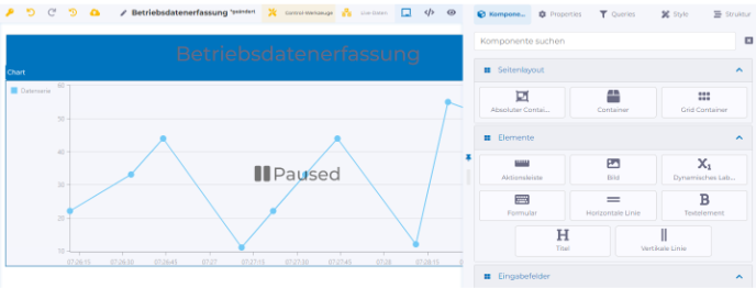
A page can be designed using components, which can be selected on the "Components" tab and dragged and dropped onto the design canvas. When a component is selected, its configurable properties are displayed on the "Properties" tab. Clicking on the publish icon publishes the changes made and switches to the page view.
The Page Designer has the following tabs:
Components
Components are used to visually design a page and can be used to input or visualize data.
Properties
When a component is selected on the design canvas, its associated properties are displayed. A description of the available properties can be found in the description of each component.
Query Overview
The Query Overview is used for creating and viewing the data model, edge data value, and workflow queries used on the page.
Style
Advanced styling properties.
Structure
Hierarchical representation of all components used on the page. Components can be rearranged using drag and drop.
Last updated